**Originally published August 19th, 2016**
I'm feeling nostalgic. Tomorrow will mark 3 years since I shipped my first game with the amazing team at Ubisoft Toronto, Splinter Cell Blacklist. To this day, it is still one of my favorite projects and the one I remember the most fondly out of all those I've worked on so far. I grew immensely as both an artist and a developer on this project. In many ways, it was the launching pad for my career and I owe a lot to both this project and Ubisoft Toronto for how much I was trusted with despite it being my first shipped game.
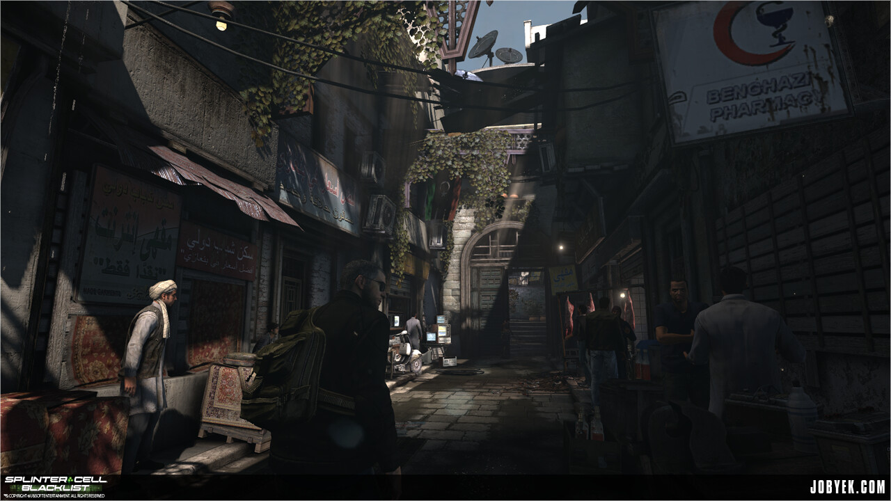
That said, I thought it would be fun to look back on the level that I worked on for the majority of production, the 'Safehouse' level set in Benghazi, Libya. Given that this was the first proper gameplay level after the initial tutorial level, we took the somewhat daunting task of making this level head on. Being a 3D Modeler at the time, I worked on this level closely with my Level Artist, Jon Boujos, our Level Designer, Nick King, our Modeler/Texture Artist, Tim Bergholz and our Texture Artist, Pierre Thériault.

Loading blog post...it's a long one, you've been warned.
If you need a refresher of the map (or a first time look!), here's a Perfectionist playthrough video.
#1_Barely Any LODs Used In Level
One thing you might have noticed playing through the level is that we barely had any assets with LODs in the level. If I recall correctly, virtually the only assets that had LODs were the great palm tree assets Tim Bergholz had made. The LEAD Engine (a heavily modified Unreal Engine 2.5), had a pretty robust occlusion system that handled 90% of our culling through hand-made occlusion meshes that lived in an invisible layer. The last 10% of assets missed by occlusion had their kill distances set by hand by both Jon Boujos and I as a fail-safe.
Due to the relatively tight structure and design initially laid out by both Nick & Jon combined with our tight culling, this enabled us to really use up the memory afforded from not having LODs to push a lot more props and clutter on-screen compared to other levels all while still running at a solid 30fps.
That said, were I to take another stab at the map today, one thing I wish we could have focused on more is push a lot more vistas throughout the map. We only revealed a bit of a vista at very key points due to the linear structure of the level, but in hindsight, we could have broken free from that more and make the level feel much larger than it actually was.
#2_Play Your Game's Other Content: A Case of Flashing Lights
Throughout Safehouse's production, I made a point to play the map almost everyday to re-assess the previous day's changes, note any previously missed bugs, etc. (Yes, that means I had to hear Elias Toufexis as Kobin in cinematics everyday) I always had a running log of things to do from those playthroughs, and they were incredibly valuable. One thing I had the chance to do towards the end of production is start going through a lot of the Co-Op maps made by our partners at Ubisoft Shanghai, as we were helping them bug fix gameplay issues to make the maps as smooth as possible for cover, Stealth, AI, etc. It was incredibly eye-opening going through their maps. I quickly realized, there that were so many little tricks and neat little things they were doing in their maps, whether it be lighting, smart optimization techniques, etc. that we didn't really do or pick up on in Singleplayer (and we were running out of time to implement new things). One thing I managed to ninja into our Benghazi map with the help of our trust Lighting team, VFX team & Sound team was selling the fact that the AI's truck was running and waiting for them to come back:
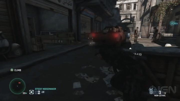
Don't you just want to cover on this truck?
I wish I could take credit for the idea, but as you might have guessed, it was a little thing I picked up from one of Shanghai's Embassy Co-Op maps. There was a garage in one of the maps with some running vehicles with their emergency lights flashing and it dawned on me...'Holy s***, why aren't we using this for our cover tutorial truck?!' (our truck originally had everything off). After a quick afternoon of running around and working with Lighting/VFX/Sound, we managed to get the implementation you see above in-game. In one fell swoop, all thanks to seeing a similar implementation in our game's Co-Op maps, we managed to lead the player to better reinforce our cover-to-cover mechanic in this tutorial section, sell the story that the mercenaries were keeping their truck running and loading it up and give some nice visual contrast to this heavily shadowed alleyway.
For me, this specific example really changed the way I've approached development for these increasingly large projects we work on with Singleplayer, Co-Op and/or Multiplayer. Next time, do yourself & other mode's team a favor...play each other's content earlier (and periodically) in development! Feed off each other's differing creativity and ideas.
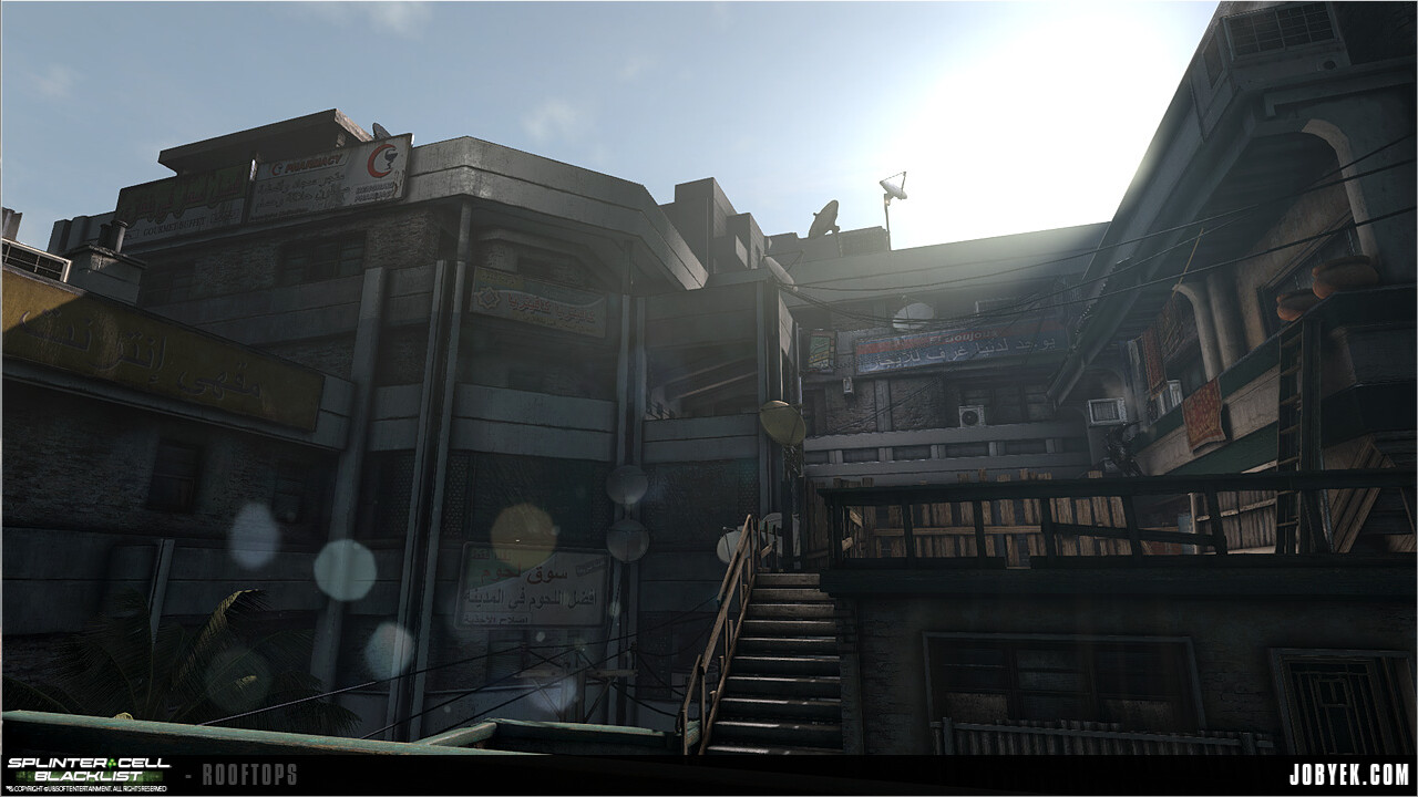
#3_Yes, You Can (get your map to 30FPS, 10 mins before content lock)
Confession time. We almost shipped a section of our map running at ~25FPS on PS3. The exterior of the Police Compound near the end of our map was our last remaining big gameplay sandbox section running under performance. It was always eating me up inside that we still had one this one section left despite all the optimizations we did. Time was running out. I was the last person on our map and, while bug-fixing something in another Singleplayer map that day, I spotted a texture. A texture using a simple shader that was very similar to the expensive vertex-blended textures we were using in our under-performing area. With a bit less than an hour to spare before Art Content Lock, I made the very last minute decision to swap out the shader we were using on our street in that area for the shader of the texture from the other map. Visually, you could barely tell the difference. I built and launched the map on PS3, holding my breath. I get to the Compound area of the map. The whole area was now running at 30FPS on PS3. I can't tell you how much that of a relief that was checking that change in 10 minutes before Content Lock. So yeah, yes you can?
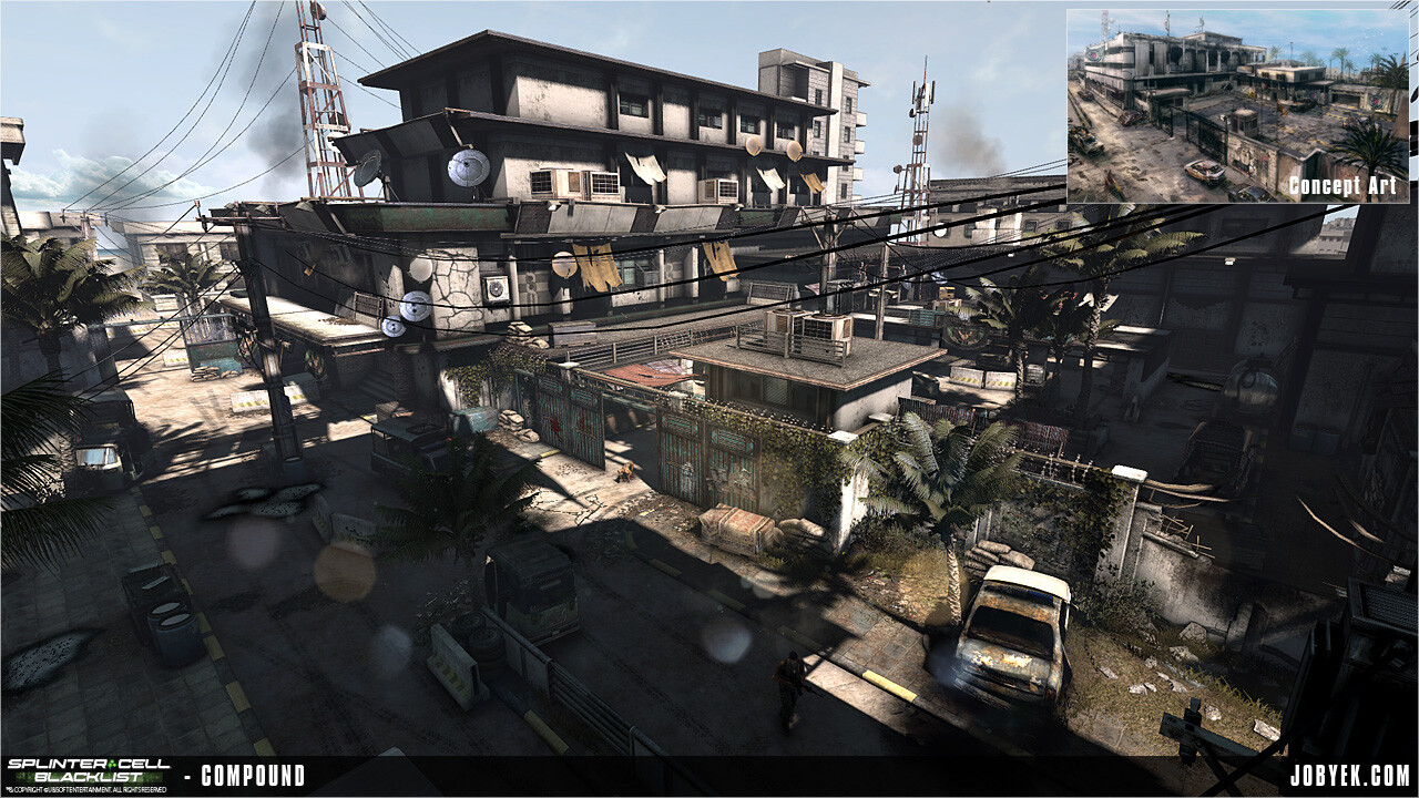
Our heaviest and largest section of the map
#4_How Far We Go To Save Memory
Ah, the days of 512mb of memory from last generation. When we say that we try to squeeze every last drop of the consoles, it's never a joke. Self-explanatory image taken from my notebook at the time (love hanging on to them!):
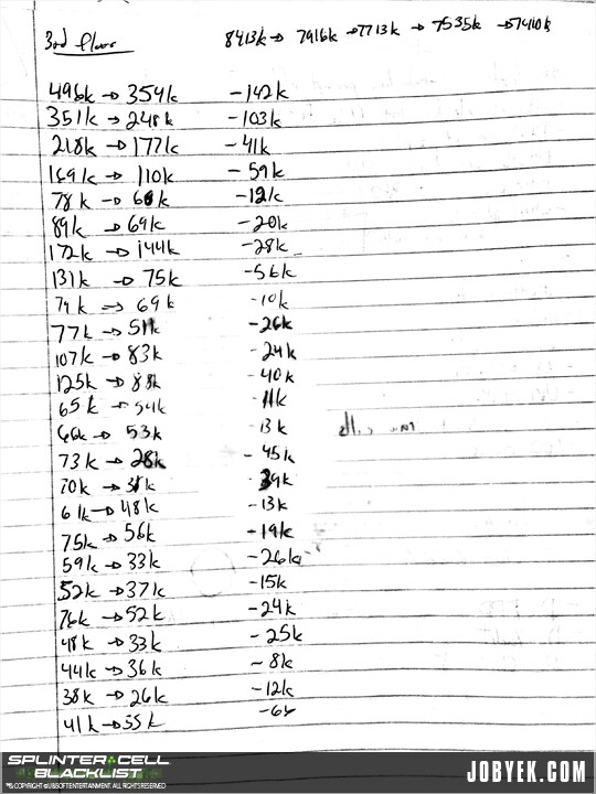
Every KB counted...
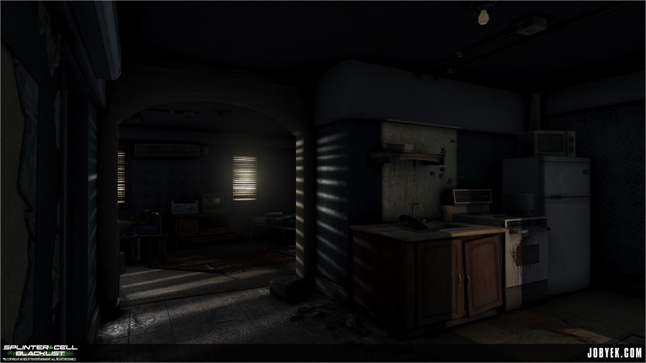
#5_Working in Passes: The Case of the Tri-Rotor
For games with multiple playstyles, gadgets and such, people often wonder how is it we go about supporting *all the things*. For me, through Splinter Cell's development, working in multiple passes was definitely key. For example, with the Tri-Rotor whose metrics got finalized a bit later in development, there was no choice but to do a big pass on the map once those metrics came in. We had to find cool and relatively natural areas to punch holes through to support a Tri-Rotor-sized vent. It almost became a fun little puzzle for each area to see which creative ways we could use to support this particular gadget. Often it even snowballed and the new opening became a great one to throw in other gadgets. For example, this backdoor leading to the Safehouse's laundry room, notice the open window at the top:

The late addition of the open window at the top became a great entry-point for the Tri-Rotor...and throwables!
The sad part is that, in all likeliness, most players probably didn't even have the Tri-Rotor unlocked at this level (though you definitely have enough money to buy it). That said, for more open-ended sandbox games, I think that's just something you have to live with, players can't and won't see everything you've worked on. For me, even if there's just 1% of players who ended up finding our little Tri-Rotor entries and felt smart and creative doing so? That's worth it.
#6_Same Structural Mesh, Different Set-Dressing
One sneaky little bit of re-use we ended up doing in the map is between two apartment complexes you go through in the map at opposite ends of each other. One apartment complex you end up going through a little later in the map ended being finished before the first one. When came time to finish the first one at the beginning of the map, I was able to re-use two entire apartment sets almost wholesale with just some set dressing changes between the two to accommodate little bits of story. This ended up being a godsend for the 1st apartment as we were knee deep trying to wrap up that section of the map for our very first press demo of the game, which our map was apart of.

The apartment later in the map
The apartment earlier in the map
One little caveat of re-using this same mesh was that it physically didn't actually fit in the 1st apartment building (woops). The interior and exterior didn't quite line up. In reality, if both the exterior and the interior of the apartment complex were loaded in the same time, you'd be seeing the walls of the interior protrude outside. Given how our loading was set-up between sub-maps, that was luckily never the case, the exterior and interior of the apartment were never loaded together so we were able to get away with the slightly hacky re-use!
#7_Cut, Copy?
Surprisingly, when I look back, not much of our map actually got cut. A lot of it came down to the great initial layout Nick & Jon established, it was a pretty solid foundation upon which to build the map. There was only one section/sequence that ended up being cut down and that's the intro of the map. It was originally supposed to be an elaborate market sequence, but it ended up being condensed down to the one we shipped with.The original plan for it ended up being way too long and for it to reach the quality needed we would have had to compromise quality and time for the rest of the map which had meatier gameplay. We ended up conserving the essence of that whole sequence and boiled it down to what shipped:
Notice Navid Khavari on the left there
#8_Light & Shadow
We knew that working on this map was going to be an uphill battle. We knew that Splinter Cell purists would want to hang us...a Splinter Cell map in daytime?! We were conscious of it all the time and it's something we honestly took to heart as a map team. A lot of onus was put on us and the lighters to come up with interesting gameplay and lighting setups to support Stealth and Panther playstyles, whether in daylight or inside. It actually was a fun challenge to come up with creative ways to create natural pools of shadows for Sam to roam in...flapping cloth outside, a turned on TV inside casting shadows, etc. As you can see from most of the screenshots I've posted of the map (and more can be seen on my site), despite being a daylight map, the map oozes with dark inky shadows whether we're inside or outside and that was fully intentional. We wanted to prove that we could do a daytime Splinter Cell map well, and to a degree, I think we succeeded (though I may be biased!).
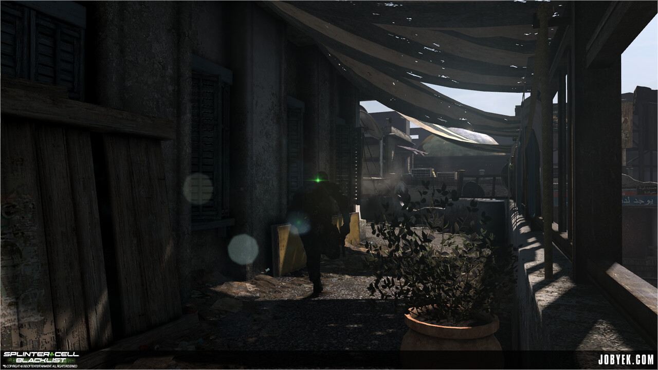
Flapping cloth created great dynamic shadows Splinter Cell is known for
One interesting issue that came up from us loving to use flapping cloth in our exteriors was that we realized that Sam wasn't registering as in shadow or stealth when under one. Turns out that in that engine, for a shadow to be recognized by Sam's light meter on his back (which turns on when in shadow/hidden), whatever was being shadow-casted had to have collision. So, one pass that I ended up having to do throughout the map was add invisible blocks of collision roughly the size of the flapping cloths to have those cloth shadows register properly. So if you run through those clothed areas...notice how his light meter turns on and off properly! The little details.
#9_"Smart Polish"
Towards the end of development, Billy Matjiunis coined the term "smart polish". We were both the last two people on our respective maps, so we were debugging and closing the map for Goldmaster submission. Technically we were only supposed to be bug fixing and doing nothing else but...in between bug fixes, we were always sneakily fitting in as much polish as we could in our maps. Material tweaks here...a chamfered edge there...some more clutter here...we called it "smart polish", wherein we had to make doubly sure our ninja polish wasn't going to break anything or cause more bugs. Luckily, after having worked with that engine for so long at that point, we knew the right levers to pull.
One bit of sneaky gameplay polish I ended doing quite a bit of was making sure we supported our little friend the Tri-Rotor as much as possible (and not in the typical ways you're thinking). The vents were all well and implemented, but I wanted to make sure the Tri-Rotor could go through everything that seemed like he was big enough to go through. One particular section of the map had a lot of wood slat walkways with pretty sizable holes that we couldn't really pass through with the Tri-Rotor due to them having very broad Navigation Collision (which the Tri-Rotor tested against). We originally kept the collision fidelity pretty low there for memory purposes, but by the end, we were in a pretty good spot, so I ended up defining the collision much more to enable Tri-Rotor navigation but also having to add an additional block of collision to still mainting player cover against the railings (you couldn't cover cleanly on non-rectangular collision).
You can fly through all those railings!
#10_Easter Eggs!
We actually had a couple of easter eggs in the map, both planned and unplanned.
If you pay close attention to the picture frames and billboards in the map, you'll notice that you may recognize some of those people and names. The caricatures of us were lovingly rendered by my good friend Nacho Yagüe:
Did I ever mention I used to be a dictator?
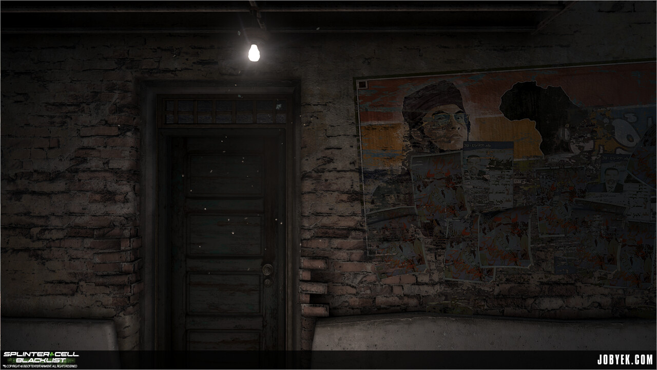
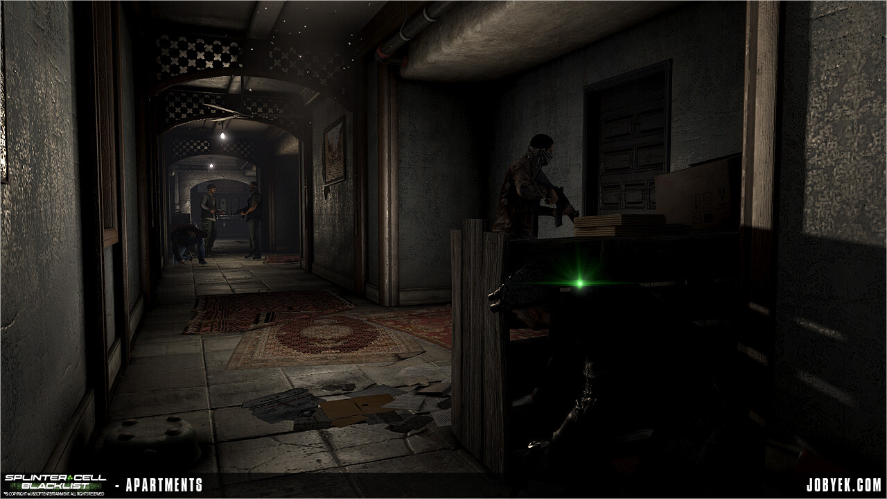
One great little detail Nick King added was in this little sequence here where militia are raiding apartments. They never break through this specific door pictured, but if you look under it with your Snake Cam once the militia neutralized, you'll notice a scared civilian cowering in their apartment:
Whew. That was a long one (sorry!). I hope that, despite the 10 points being all over the spectrum, this was useful and/or fun to read through! It certainly was fun for me to remember a lot of these anecdotes and tidbits. If you ever have any questions, you can hit me up on Twitter @jobyek as usual!


