My Guiding Art Principles
From Modeler to Level Artist
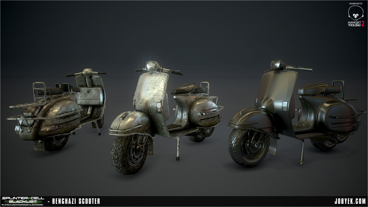
As a Modeler at Ubisoft, you're typically responsible for modeling and texturing all your own environmental props under the guidance of a Level Artist (if it's a more linear Singleplayer game) or a Lead Artist managing a pool of artists (if it's more of an Open World game). To start out in the industry, that's great. It let's you really focus on the details, the nitty gritty art/tech details and start to have you worry about gameplay constraints (cover, vaulting, etc.) and really start developing your eye for all of that. And from there, if you so choose, you can grow into doing level art given the chance. It's something I slightly miss, but what I realized transitioning from Modeler to Level Artist, is that a lot of the same principles apply, just on a different scale.
Some of the core principles that I subscribed to whenever I start a prop, in no particular order:
- Context - From a core question like: Where is this prop being used? You can extrapolate many other questions: How is a person using it (where are the hand and feet going)? What weather or natural elements are affecting it? Etc. All of those inform my decisions in both modeling and texturing and not to mention reference gathering. I never add any detail just for the sake of detail. Everything should have a purpose or a reason it's there, however small the reasoning is.
- Imperfection - This is a tenant I've carried with me ever since our very first high-level Art Direction meeting with Scott Lee. One of the art pillars of Splinter Cell: Blacklist was Imperfection. That's something that applies whether you're making something for a war-torn map, an abandoned warehouse or a perfectly pristine government facility or private estate. Nothing in life is ever really perfect. There's always some sort of imperfection whether it be in its placement, its shape, its material quality (this is where you get a lot of your imperfections for 'clean' environments), etc.
- Gameplay - Does this prop need to be gameplay friendly? Does the player need to take cover behind it? Can the player vault over it? Is it purely visual dressing and other props will stack near it to form cover instead? A lot of those questions can drastically change the design and approach of whatever you're making, so it's good to answer those questions early.
The Big Picture
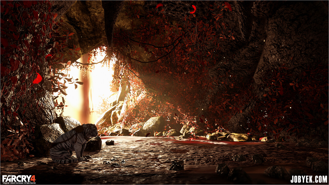
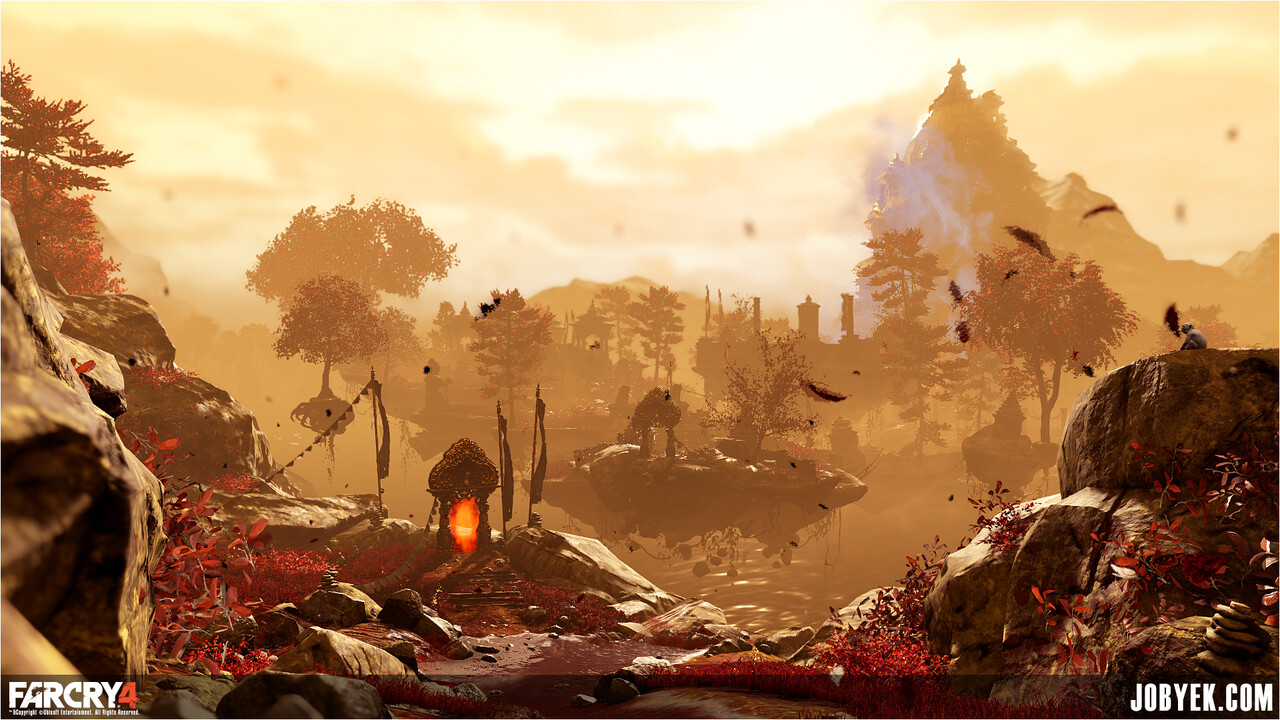
A (playable!) vista reveal that I was particularly proud of in my Shangri-La map in Far Cry 4.
- Context - What is the narrative of the world/location your level is set in? What is the gameplay or story beat that needs to be hit in this area? How is VFX & Lighting coming into play? How are all those factors affecting your environment? Etc. The more questions you ask yourself, the more you can ground your environment by directly answering those with your art's layout.
- Imperfection - Again, same principle I've been carrying with me ever since Splinter Cell. Although, instead of applying it on the macro level on a prop, you're blowing that up to the scale of a whole level. Imperfection can apply to the placement from anything small in the level (rocks, trash, etc.) all the way to the large (architecture, entire sections of level, etc.). Things are rarely ever perfectly straight or perfectly on-grid (which can cause a lot of back and forth with Level Design depending on how rigid your gameplay features are).
- Gameplay - Design and gameplay naturally plays an ever bigger role as you're working on a full level. You have to be in total sync with your Level Designer to make sure you preserve (and even add to!) their gameplay intentions all while making everything look pretty. At the end of the day, we're game artists, not just Artists. You could have the most beautiful level, but if the gameplay is s***, it's a bad level and it won't be memorable. Some things you naturally always have to think about: How is the player flowing through these spaces? How does it feel to flow through---Natural? Kind of awkward? Can we get a nice reveal here through layout?Where are his natural cover points? Where can he vault? What can he climb? All things you need to constantly worry about and feel out by constantly playing your level. Something I make a point to do almost everyday first thing in the morning if I'm working on a map.
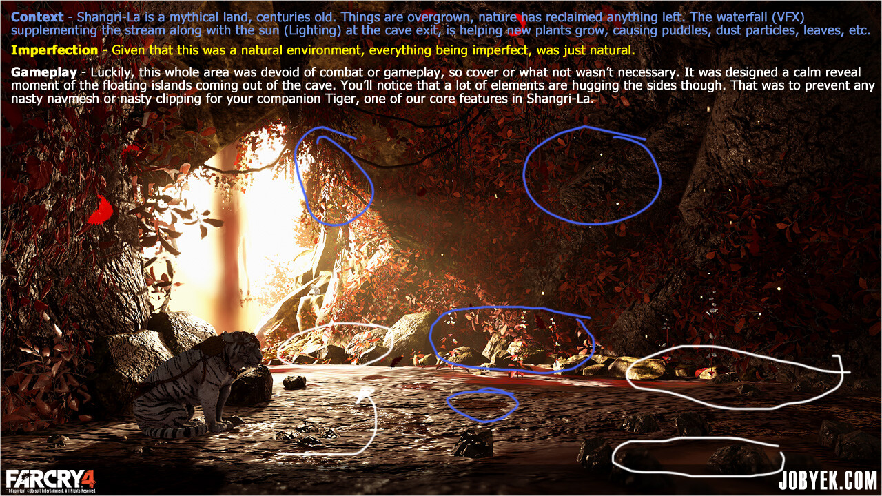
How I applied this practically in this shot from the Shangri-La level in Far Cry 4 (which happened to be the intro shot of our hands-on Gamescom 2014 demo):
And on that note, that pretty much concludes my very first blog post. Hopefully the first of many. Sorry for the overly 'wordiness' of it all (there's some pictures!), I tend to write too much. Will need to learn how to be more succinct in my writing!
I'd love to hear from other artists in the comments, on Twitter @jobyek, whatever! How similar or different is your approach to making a prop or an environment? Always good to get different perspectives. If you have any questions too, feel free.
Cheers,
Jobye


