So, for my next blog post, I wanted to totally switch gears from talking about high-level art principles, and drill down to a little "micro-tutorial" on...wheels. Like I said in my first post, I really want this blog to cover a whole range of topics: articles, analyses, tutorials, WIPs, etc.
And here we go! Happy reading!
----------------------------------------------------------------------------------------
Why Wheels?
[tl;dr - If this post is looking too long for you to read right now, scroll to the bottom for a nice big recap image :)]
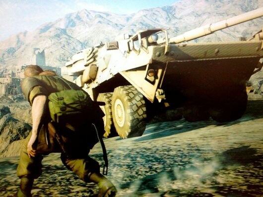
Wheels are arguably what makes or breaks a vehicle in game art. You could have the best looking vehicle body, but if the wheels suffer in quality, the whole vehicle does too inevitably. Case in point, I recall this one teaser screenshot Kojima released 4 years ago to tease The FOX Engine/MGSV:
Teaser image released by Kojima back in 2011 for The FOX Engine
You have this nicely detailed vehicle, then your eye scans down and see the sore spot of the wheels that are really flat, lacking any good shapes/volume and that are of a much lower quality and resolution than the vehicle itself. (To be fair, the vehicle might not have been final/ready to show and marketing might have taken it anyways, definitely something that happens sometimes.)
All that to say, this little micro-tutorial will focus solely on creating high-quality & efficient wheels. There are tons of tutorials that focus on full vehicles, so I figured I'll focus one this one part which can ultimately help elevate an already great vehicle.
Surprisingly, after having looked around online, I haven't seen the technique I'll be outlining below mentioned at all. It's definitely a technique that's used more for modular structural environment art to get the best resolution and quality (see how Simon Fuchs uses this with his small environment), but not one I've seen applied too much to something as small as wheels. It's a nice technique that I learned from my good friend and super talented colleague Tim Bergholz (Check out his upcoming gumroad tutorial!) during our time working together on the Benghazi map in Splinter Cell: Blacklist.
Surprisingly, after having looked around online, I haven't seen the technique I'll be outlining below mentioned at all. It's definitely a technique that's used more for modular structural environment art to get the best resolution and quality (see how Simon Fuchs uses this with his small environment), but not one I've seen applied too much to something as small as wheels. It's a nice technique that I learned from my good friend and super talented colleague Tim Bergholz (Check out his upcoming gumroad tutorial!) during our time working together on the Benghazi map in Splinter Cell: Blacklist.
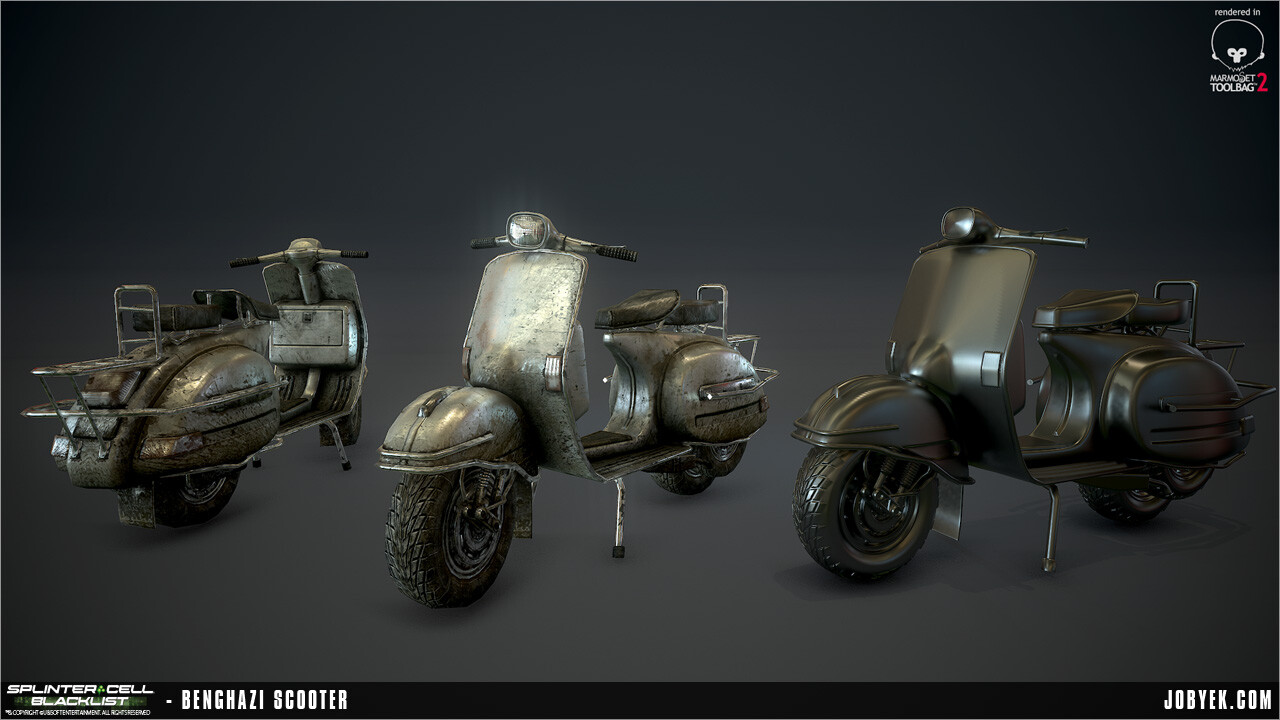
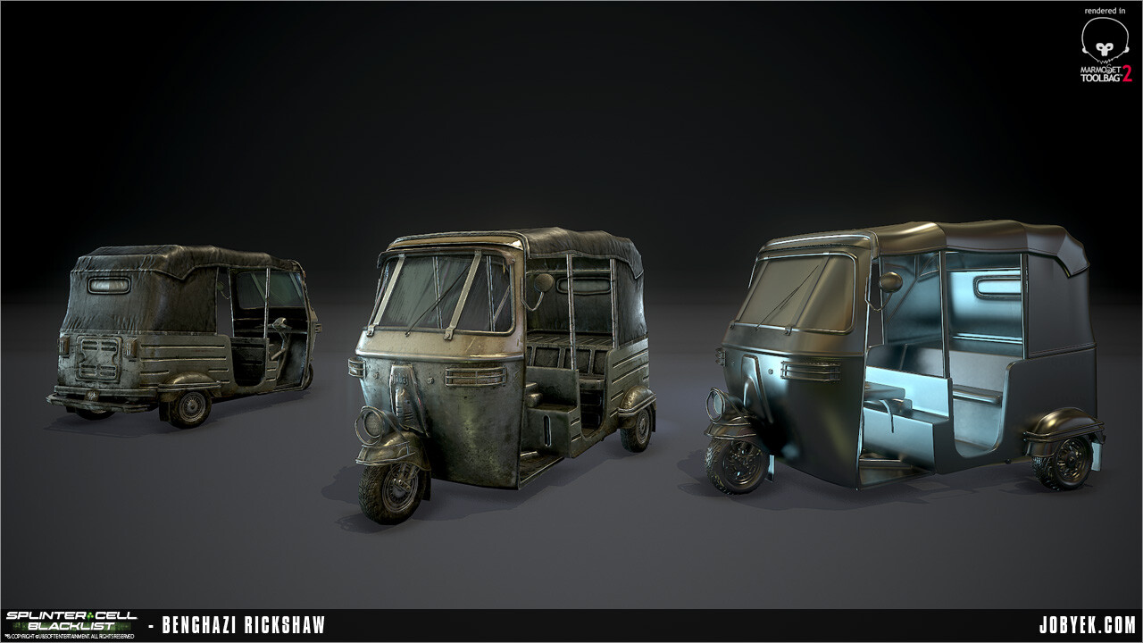
Through the tutorial, I'll be going over the creation of wheels similar to ones that were used in my portfolio pieces from Splinter Cell: Blacklist:
0. Symmetry & Quartering Are Your Friend
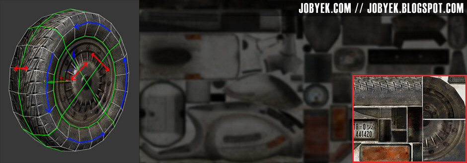
The over-arching technique that guides this whole tutorial to achieve the best resolution and quality out of your wheel is that of symmetry and quartering. By not fully uniquely unwrapping your wheel tread and sides and only being able to focus on a quarter of your wheel, you can maximize its resolution (by maximizing the quarter shell size to what you would use for a unique unwrap all while leaving room for other elements) and make it match if not exceed the resolution of the vehicle body as well as speed up texturing time (although it comes with its own challenges to make sure details don't tile badly). Knowing this, you need to fully keep this in mind as you flesh out the design for your wheel/treads/rims/etc.
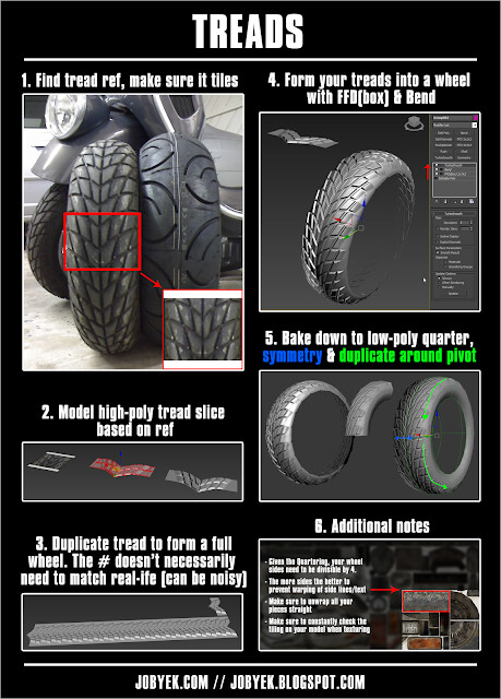
1. Creating Treads
I've personally seen a few tutorials of creating high-poly treads like this, but here's a quick overview framed within the symmetry/quartering technique. The most important thing is to make sure your design tiles well so that the symmetry/quartering works flawlessly:
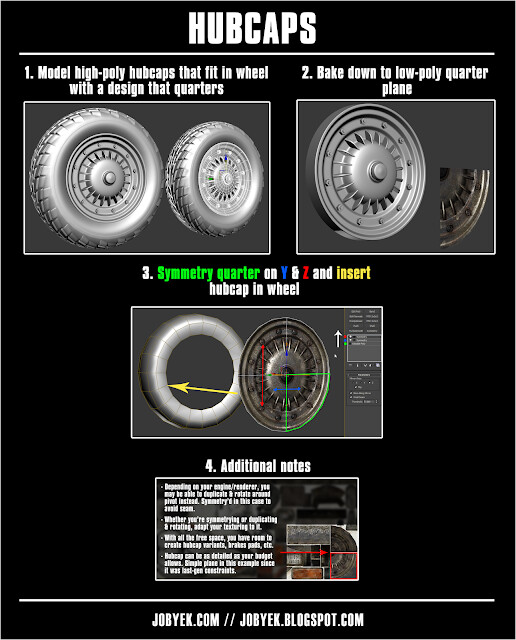
2. Creating Hubcaps
Again, nothing out of the ordinary for creating the hubcaps. Where it diverges from most methods is in the quartering/symmetry of it to get the best size and resolution within your UV sheet. Given we're using this technique here, you just need to make sure your design quarters well and always pay attention your spacing is cleanly fitting within a 360 degree rotation. Here's an overview of hubcaps framed within the technique:
Click on image for full-size
3. Closing thoughts
And there it is. Doing this technique is definitely a bit more involved and takes some light planning. However, for the gains in quality and resolution you get for the vehicle as whole through the wheel, I think it's worth doing. Symmetry and quartering shouldn't just be used for this, it can also obviously be used for any type of repeating parts of a model (e.g. either side of a vehicle, concrete dividers, tank treads, etc.) which you don't want to double up work on and save precious UV space, so long as you break it up cleverly in the texture or with other unique middle pieces in the model.
As always, I'm always open to critique & feedback to the blog post. All I've said can most definitely be updated if anyone brings up any issues or things worth clarifying. Just give me a shout on Twitter @jobyek or in the comments!
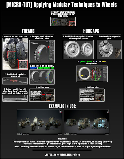
One last thing...here's a nice big high-resolution recap page of all this:
Click on image for full-size
----------------------------------------------------------------------------------------
Links used in article:
Simon Fuchs' use of quartering in an environment: http://www.simonfuchs.net/folio/project06.htm
Tim Bergholz's Portfolio: http://www.timbergholz.com/
Tim Bergholz's upcoming Gumroad tutorial: https://gumroad.com/timb
